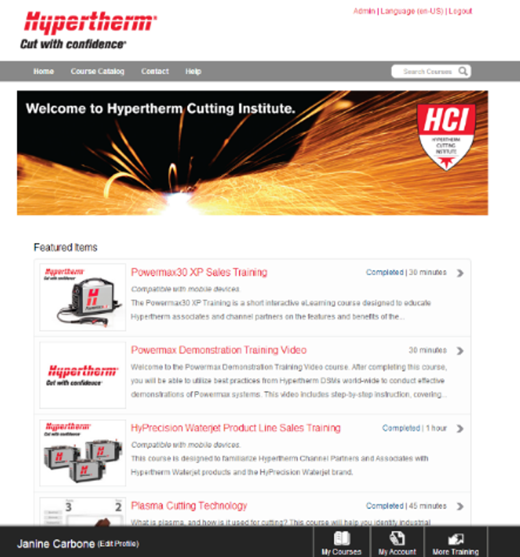
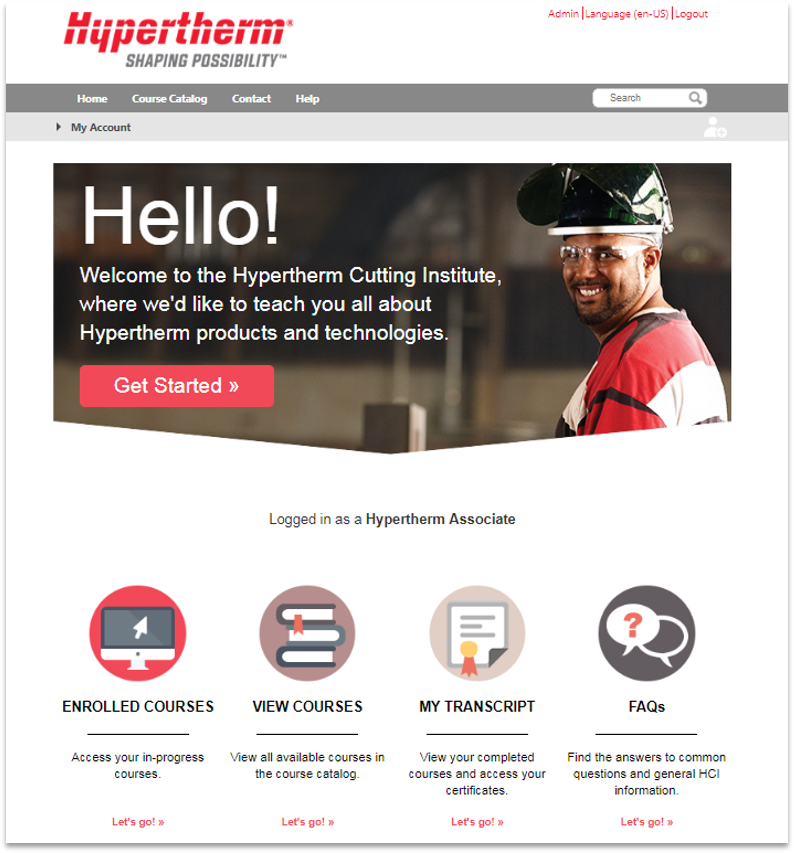
One of the unique things about this particular LMS is that it is accessible to anyone on the planet - for free. However, it is a Single Sign On (SSO) through a secure system that registers the type of user you are, and that security level will determine what content is available to you, as well as what the LMS will look like. Channel Partners will experience a different experience and see different home pages than a product user.
The problem with the original LMS, when I joined the team, was it was not user intuitive. There was barely any branding nor organization of the site. Contact and help pages were non-existant, and catalogs and categories for browsing were not being utitlized. No meta data was being attributed to courses, so searching was impossible.
Working within the bounds of the LMS provider, I collaborated with the developers of the company to open up custom coding capabilities so I could truly customize the learning experience. Using the built-in capbilities and custom code, I created a fully responsive experience for each type of user, essentially building three separate websites determined by the SSO security group.
The new website now full embraces meta-tagging search mechanisms, course coding, catalog and category organization, training tracks for recommended training paths, badges, among many other features.

